
HOW RESPONSIVE DESIGN CAN HELP TRAVEL SITES
A guest post by Miltos Kritakis to tnooz.com
2013
As everybody is aware, for the past four years Greece has been on a rollercoaster of economic turmoil. Travel is always hugely affected by these situations as domestic sales decrease.
Here we have a statistical paradox though it’s nothing to do with the term “Greek Statistics” which has come to mean false stats. Even if the local travel market has decreased by 40%, Greek online travel agents are expanding their business.
Many would say this is a universal trend, which is true, though the question is how Greek OTAs have been able to increase their market share not only because of channel change but also expand it on a global level?
The answer, or a big percentage of it, lies in the crisis. Local OTAs have been in a situation where they had to lower their fees in order to be competitive in the domestic market as more and more travel agents made the step from offline to online. While this has meant a temporary positive boost to turnover it also kills profit for the OTA. So, the motto has changed from “how can I be cheaper” to “how can I get the most from my visitors”.
Terms such as conversion optimization and usability were already known and applied on the web, but what happens with mobile devices and tablets which are steadily increasing their share of OTA website visitor traffic? The term “responsive design” has come to the fore in order to fill an apparent void in the mobile market. Meaning, an approach where the web design is crafted to provide an optimal viewing experience for users with mobile devices (ie. phones or tablets).
The beauty of responsive design is that you care about the screen dimension and resolution and not the platform. So instead of creating an app, let’s say only for iOS, you can now create a new website version, optimized to run smoothly at screen resolutions and sizes equal or near the screen size of not only the iPhone but also any other device, without sweating if you have chosen wisely between iOS or Android.
Nice theory, let’s talk about numbers…
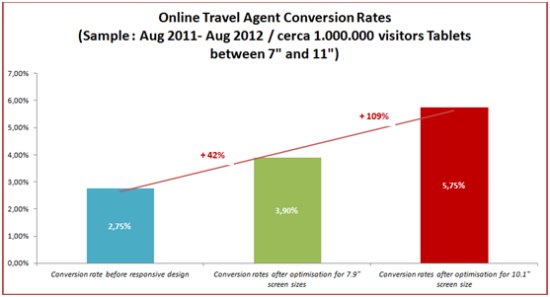
This chart shows how conversion rates improved dramatically when responsive design made its appearance. Our sample is based on nearly one million visitors from Aug 2011 to Aug 2012 using only mobile devices and more specifically tablets of various brands and sizes.
Tablets give a higher ratio of conversion versus the website or smart phones. These relatively high conversion rates could be increased further with the appropriate optimization of the design in order to fit nicely on the two most common screen sizes (7.9-inch and 10.1-inch screens).
As it’s illustrated on the chart the first optimization to 7.9-inch screens provided a conversion rate increase from 2.75% to 3.90%, while optimizing at 10.1-inch (best for the new iPad , Samsung Galaxy Tab 10.1 , Asus Transformer Prime) the conversion rate was boosted by 5.75% – representing a 109% increase from the original 2.75% rate before optimization.
Maybe for small to medium size OTAs this isn’t a big change, but, as the volume of visitor traffic rises and the cost of bringing this traffic to your service is gets higher and higher maybe a 109% increase in conversion rates looks more attractive.
Could responsive design be the new black in website design?
Read the original guest post here.
