
THE NEW SKROUTZ.GR AND THE RESPONSIVE DESIGN TECHNOLOGY

2012
Skroutz S.A. approached us, with the goal of redesigning the company's website, maintaining, among others, a very specific demand: The design should use the technology of Responsive Design.
Outlining Responsive Design
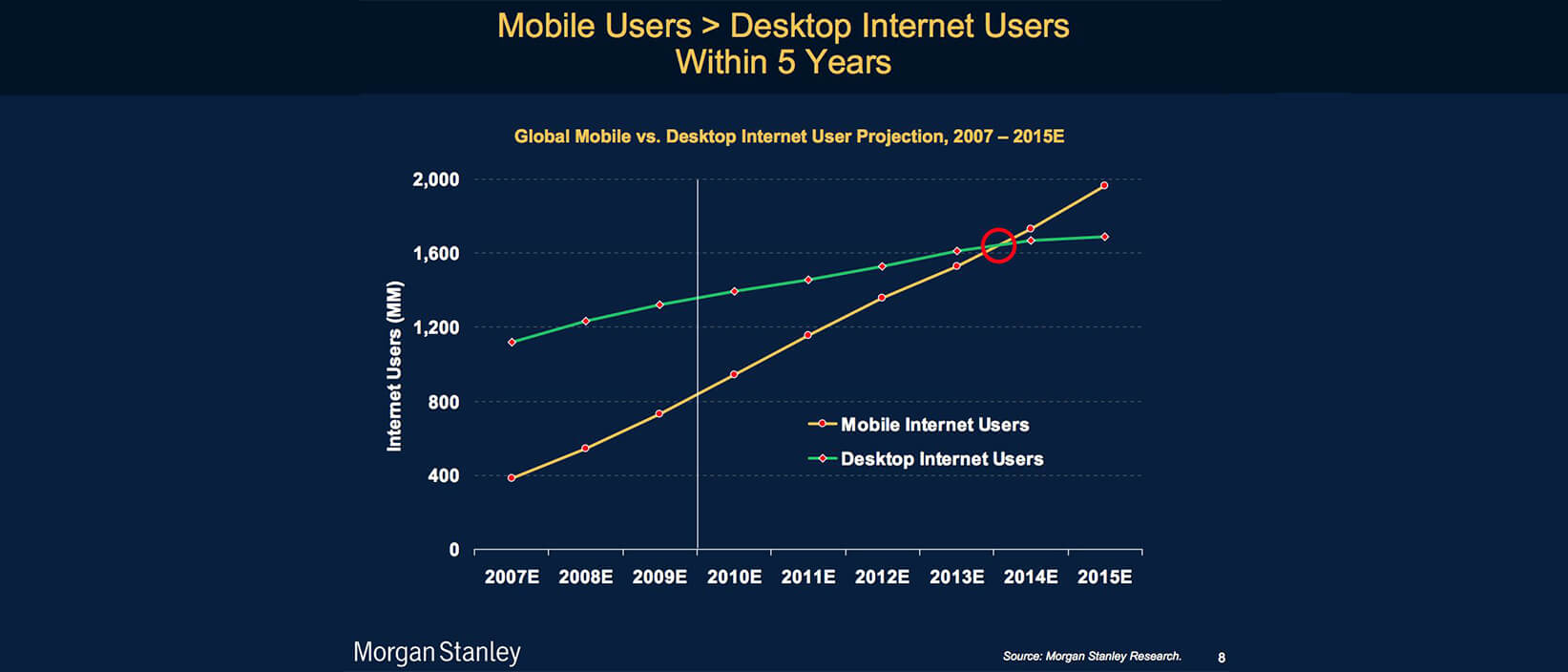
In recent years, there has been an exponential growth in the number of people who use mobile devices to access the web. Indicatively, according to a research conducted by Morgan Stanely, users who "surf" the internet through their mobile device are expected to exceed thos who use their traditional desktop personal computer.
This situation initially caused problems in the design and implementation of websites. Web agencies were then obliged to take into account three important details:
- The screen resolution of each device, which varies from a very small smartphone screen (eg iPhone), to a 24'' or even 27'' desktop monitor.
- The navigation throughout the website, achieved either through the users' fingers on smartphones and tablets, or through the mouse and trackpad on desktops and laptops.
- Full compatibility with the W3C designing standards, in all designing versions.
The above specifications required multiple design templates of each webpage, resulting in an added cost and time, for clients and agencies alike. A solution had to be found; and the solution was a completely new technique, known as Responsive Web Design. A technology that allows the graphic environment of the webpage to automatically adapt to the screen of the user's device.
Ok, surely it's not as easy as said, since Responsive Design (not to be confused with Adaptive Design) makes use of three complicated parameters: The CSS3 Media Queries, used to describe the technical capabilities of the device that will display the webpage, the Fluid Grids, allowing the webpage to adapt to the needs of each user and, finally, the Flexible Media, which are modified according to the resolution.
And this is just the beginning...
Responsive Design is a valuable tool for every web agency wishing to answer to their clients' needs with solutions of high quality and ensure the proper display and functionality of their websites across platforms.
Certain older browser versions though do not support CSS3; as a result, some problems must be expected. Nevertheless, technological progress will fix this problem very quickly and we will begin to see more and more attempts to redesign websites, under the concept of responsiveness.
In any case, Responsive Design signals a new era in web design. Stay tuned for more ATCOM responsive projects!

